
In NeetoSite, we have predefined responsive settings that automatically adjust the appearance of elements when the user's device changes, such as from Desktop to Tablet or Mobile view. These responsive settings are applied to properties like font size, margins, and padding.
Visualisation:
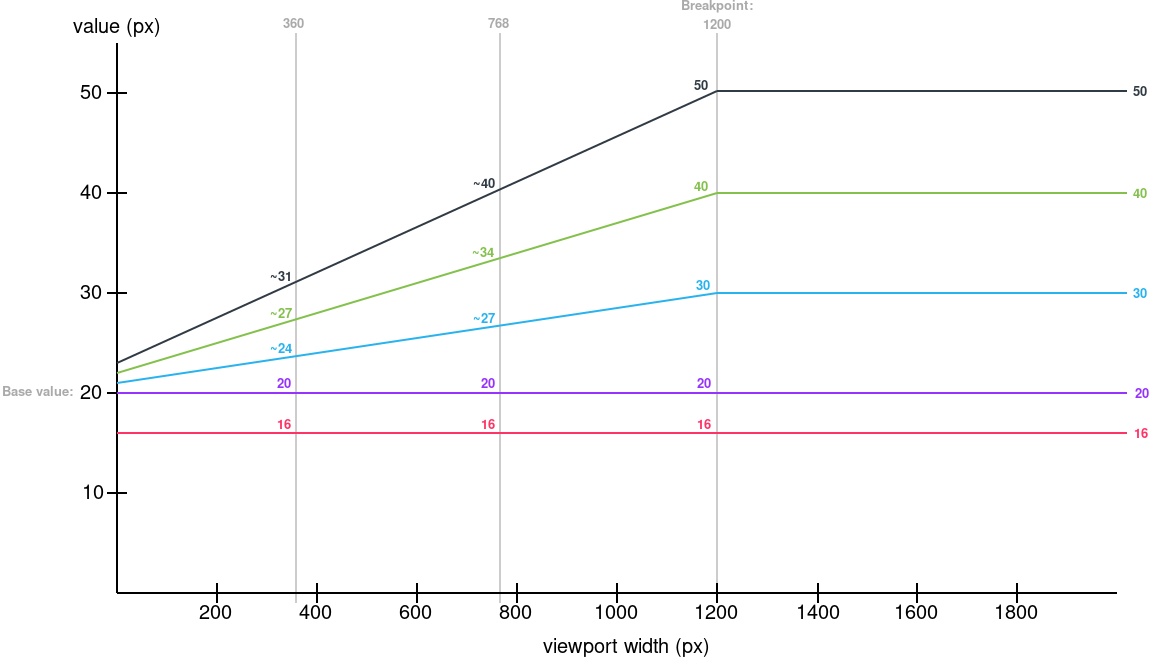
The following graph illustrates how different values in pixels (px) correspond to computed values in pixels (px) based on the viewport width (vw). It provides a visual representation of how our responsive settings affect the appearance of elements as the viewport width changes.